
2026 Color Trends for Custom Tins: Translating Pantone to Metal
Every designer knows the struggle: You pick the perfect Pantone color for your brand, but when the packaging arrives, it looks dull or dark.
Why? Because you are printing on silver, not white paper.
As we embrace the color trends of 2026—which are shifting towards "Digital Pastels" and "Earthy Terracottas"—understanding how ink reacts with tinplate is crucial. At JB Packing, we don't just print; we color-manage.
Here is how to ensure your 2026 packaging pops, and how to use the metal itself as a color.
1. The "White Base" Rule (How to match Pantone perfectly)
Tinplate is naturally silver-grey. If you print a bright yellow directly onto it, the grey steel will show through, turning your yellow into a "muddy green."
To get vibrant, accurate color matching (like your brand's specific Pantone code), we must first apply a White Base Coat (Primer).
The Process: We treat the metal like a canvas, covering the silver entirely with white ink before printing your design.
When to use it: For logos, text, and any design where color accuracy is non-negotiable.
(Example: See the vibrant colors on our [Custom Printed Biscuit Tin], achieved with a full white base.)
2. The "Metallic" Trend: Transparent Inks (透铁印刷)
In 2026, the biggest trend isn't covering the metal—it's flaunting it. Instead of using a white base, we use Transparent Inks. This allows the natural metallic shimmer of the tinplate to shine through the color.
The Effect: A standard "Red" becomes "Metallic Ruby." A standard "Yellow" becomes "Gold."
Design Tip: Use this technique for background patterns or premium borders. It creates a luxury metallic look without the cost of expensive metallic inks.
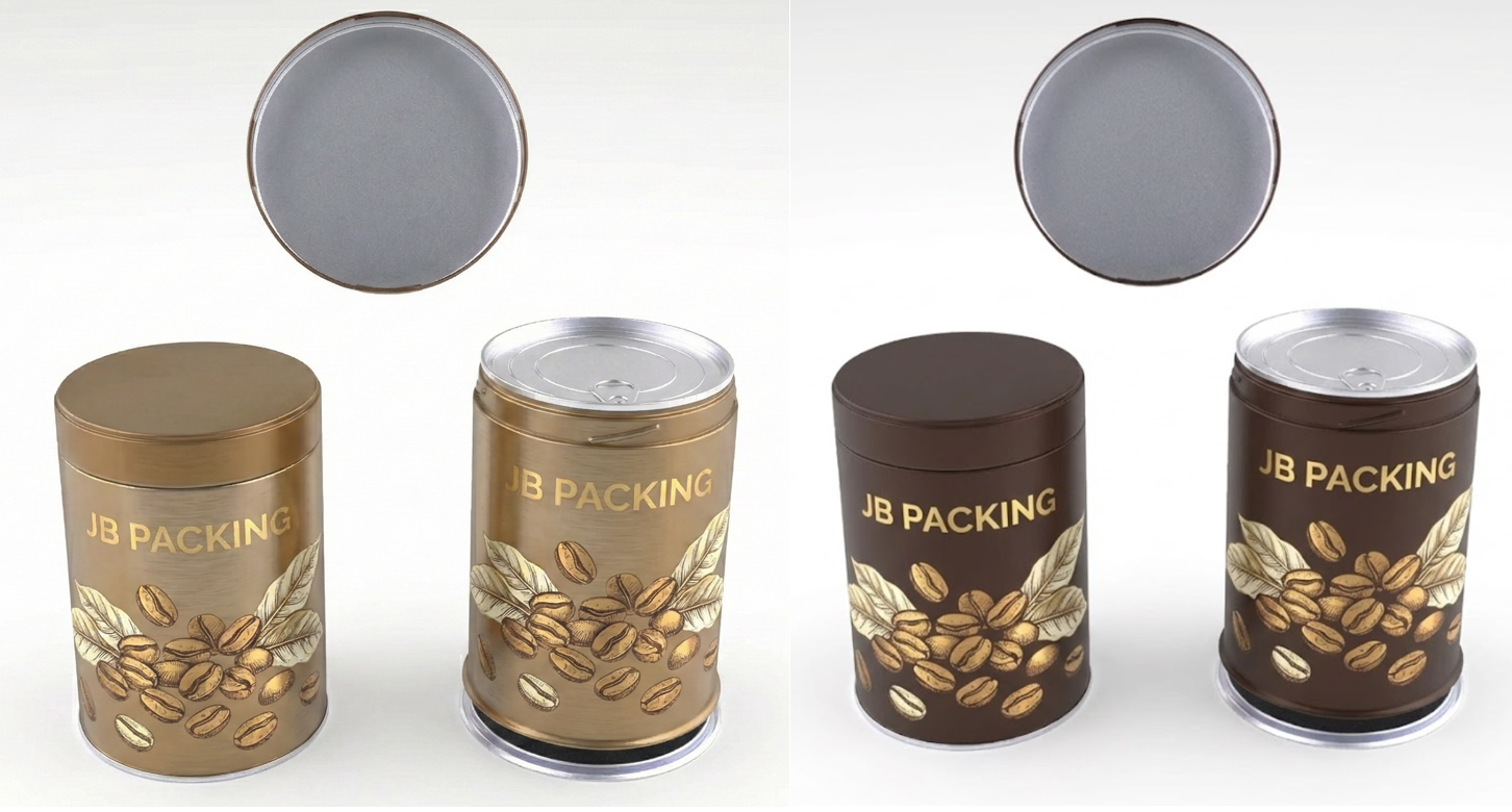
Left: Transparent ink allows the steel grain to shine through. Right: White base coating ensures accurate Pantone color matching.
3. Texture Modifies Color (Matte vs. Gloss)
Designers often forget that the Varnish (Finish) changes how we perceive color.
Gloss Varnish: Increases saturation. It makes blacks deeper and reds brighter.
Matte Varnish: Desaturates color slightly. It adds a "creamy" or "foggy" filter, which is perfect for the 2026 Pastel Trend.
(Deep Dive: Read our full comparison of [Glossy vs. Matte vs. Crackle Finishes] to see examples.)
4. 2026 Palette Prediction: "Eco-Luxe Greens"
Sustainability is driving color choices. We are seeing a massive surge in Deep Forest Greens and Sage Tones.
Challenge: Dark greens can look almost black on metal if not lit correctly.
Solution: We recommend using Spot UV on dark green tins. The contrast between the matte green background and the glossy logo makes the color readable and rich.
Precision Matters: We use white base coatings to ensure your brand's Pantone color looks exactly the same on metal as it does on paper.
💡 Designer's Checklist for Metal
Before you send us your AI (Illustrator) files, check these 3 things:
Layering: Did you specify which elements need a "White Base" and which should be "Transparent"?
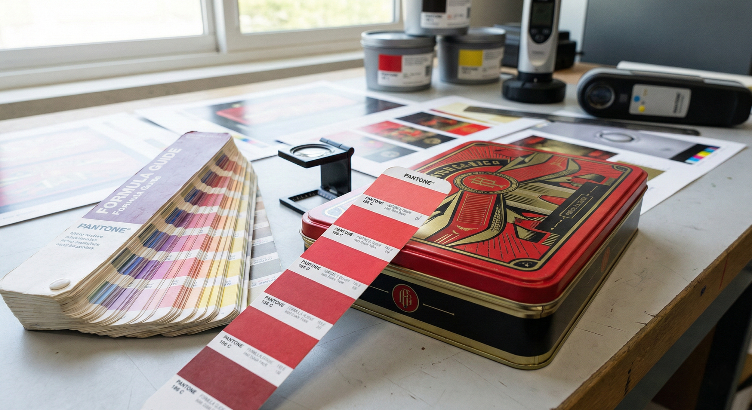
Pantone: Did you provide solid Coated (C) Pantone codes? (CMYK values vary too much on metal).
Bleed: Did you leave enough bleed area for the tin forming process?
Not sure how your design will look on metal? [Contact JB Packing] today to request a "Metal Proof" (打铁样) and see your colors come to life.